Customers rarely abandon a cart because of the price. In most cases, it happens because something in the buying process feels unclear, complicated, or risky. WooCommerce UX Psychology helps you understand how people make decisions inside your store and what stops them from completing a purchase. When you design the experience to match natural human behaviour, not just nice visuals, you reduce hesitation, build trust, and guide users smoothly toward checkout. Even a few small adjustments can dramatically improve conversions and turn lost opportunities into real sales.
What is WooCommerce UX Psychology and why it matters?
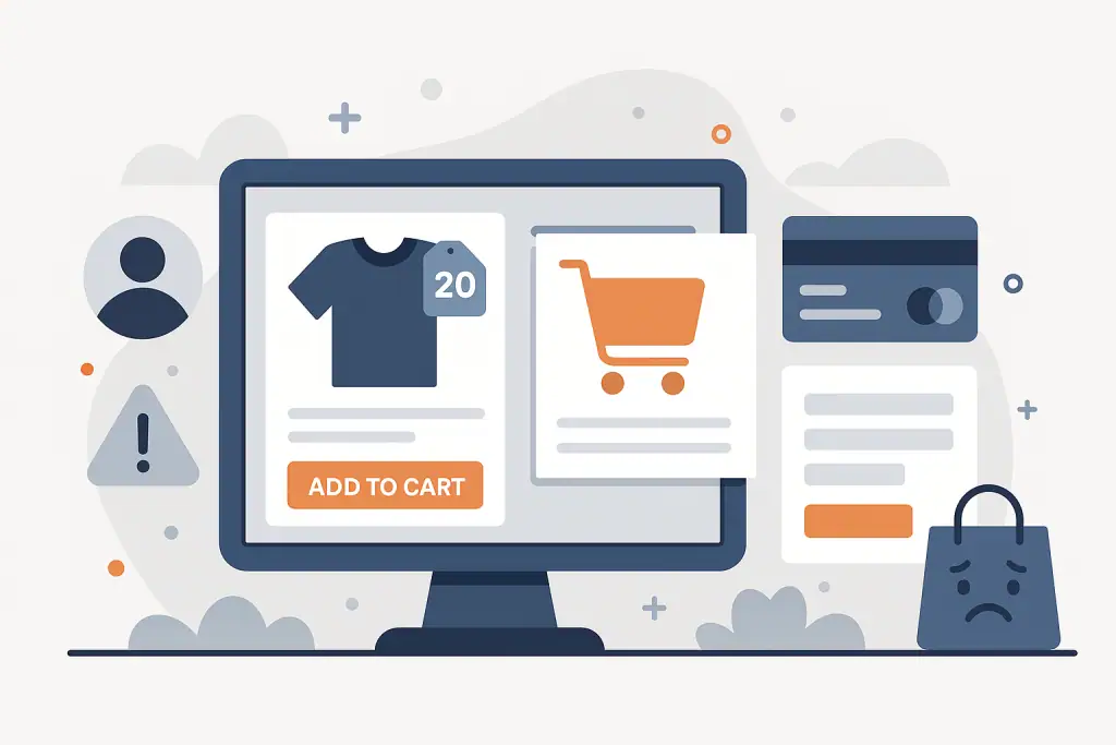
WooCommerce UX Psychology is the study of how customers think, feel, and behave when they browse your store, add products to the cart, and move through the checkout. It focuses on small details that influence decisions, clarity of information, perceived risk, trust markers, friction, visual cues, and how easy everything feels. Even a tiny annoyance, like an unexpected cost or a confusing field, can trigger hesitation and cause people to leave.
It matters because most cart drop-offs don’t happen due to price or competition. They happen because the experience feels complicated, slow, unclear, or risky. When your WooCommerce store matches the way people naturally make decisions, customers move through the process with less effort, more confidence, and fewer doubts, and that directly increases completed orders.
👉 Need help improving your WooCommerce UX Psychology?
How WooCommerce UX Psychology works in practice?
In practice, WooCommerce UX Psychology is about removing friction and reinforcing trust at every step of the buying journey. Customers make quick decisions based on clarity: “Do I understand what I’m buying?”, “Is the store trustworthy?”, “How much will I pay?”, “How fast will it arrive?”. If the store answers these questions instantly and naturally, the customer moves forward without second thoughts.
Real UX work often comes down to simple things. Clear product photos. Honest descriptions. Transparent delivery and return details. Predictable layout. A checkout that feels short and easy. People don’t abandon carts because a button isn’t fancy, they abandon carts because the experience feels uncertain or requires too much effort.
This psychology also includes emotional triggers – urgency, social proof, and reassurance. A small message like “Free returns”, “Secure checkout” or “2–3 days delivery” often reduces anxiety and keeps the customer moving.
Why understanding WooCommerce UX Psychology improves conversions?
When you understand how customers behave, you can design a store that fits their natural expectations instead of forcing them to work harder. This results in higher trust and fewer drop-offs. For many stores, improving UX increases conversions faster than any SEO tweak or advertising budget, because you’re fixing the leaks directly in your sales funnel. A store that feels simple, predictable, and safe will naturally convert better, even without extra marketing. UX psychology is one of the few improvements that influence every visitor, no matter where they come from.
How to apply WooCommerce UX Psychology step by step
Start with reducing friction. Look at your product pages and checkout as if you were a new customer: Is everything clear within 3–5 seconds? Do you know the price, delivery time, and what exactly you’re buying? Most UX problems come from missing or hidden information. Add short, clear blocks: delivery time, return policy, what’s included, warranty, payment options. This alone can significantly reduce hesitation.
Next, simplify the checkout flow. Remove unnecessary fields, shorten labels, and hide advanced options unless they’re needed. Customers abandon carts when the process feels long or demanding. Use autofill, make buttons obvious, and make the order summary visible at all times. Small improvements compound, even removing one confusing question can increase completion rates.
Finally, add trust signals in places where doubts appear. These can be badges, customer reviews, store guarantees, or even a simple note like “Secure checkout with SSL”. People want reassurance they are making a safe choice. The smoother and clearer the process feels, the less mental effort users need, and the higher your conversions climb.
👉 Want help applying WooCommerce UX Psychology to your store?
Common UX mistakes and how to avoid them?
One of the biggest mistakes is overwhelming customers with too many choices or too much text. When the brain has to process too much information, it slows down, and hesitation leads to abandoned carts. Keep content simple, break long sections into small chunks, and guide the user visually.
Another common issue is unexpected surprises at checkout: hidden delivery costs, mandatory account creation, or fields that feel unnecessary. Customers instantly lose trust when something appears only at the last step. Be transparent from the beginning, clarity builds confidence, and confidence drives conversions.
How WooCommerce UX Psychology affects sales, trust, and checkout completion?
Understanding UX psychology changes the entire flow of your store. Instead of pushing users to buy, you remove barriers that stop them from buying. This naturally increases conversions because customers no longer need to think twice or re-check details. A clear, predictable experience makes buying feel effortless.
It also strengthens trust. When customers feel guided rather than overwhelmed, they’re more confident, more relaxed, and more willing to complete the purchase. Good UX reduces doubts, reduces cart abandonment, and increases the number of people who return to your store-because the experience simply felt good.
When WooCommerce UX Psychology is especially important?
WooCommerce UX Psychology becomes critical when your store attracts visitors but struggles with conversions. If you have traffic from Google, ads, or social media, but sales don’t grow, the problem is almost never the product, it’s usually the experience. This is when psychology-driven UX reveals where users get confused, overwhelmed, or uncertain.
It’s also essential for stores targeting mobile users. Most online shoppers browse on their phones, which means less space, shorter attention spans, and higher expectations for speed and clarity. Small UX issues feel even bigger on mobile, and fixing them can immediately reduce abandonment rates.
How to combine WooCommerce UX Psychology with other tools and strategies?
WooCommerce UX Psychology works best when paired with smart analytics. Tools like GA4, Hotjar, or Clarity show where users hesitate, scroll back, or drop off. This helps you confirm what the psychology already suggests, friction points appear where information is missing or the process feels too heavy. Combining UX psychology with actual user behaviour creates a powerful improvement loop.
You can also connect UX insights with SEO and paid ads. When your store is easier to use, every click becomes more valuable. Better UX means more conversions from the same traffic, which lowers your acquisition cost and increases your return on ads and SEO.
What to do when UX issues cause cart abandonment?
Start by identifying where users leave. Is it the product page? Cart? Checkout? Each step tells a different story. If they leave on product pages, your offer might be unclear. If they leave at checkout, there’s likely too much friction, too many fields, or unexpected costs. Use this information to fix the exact point of frustration rather than guessing.
Once you know the problem, apply small, targeted changes: clearer labels, fewer fields, upfront delivery costs, a shorter form, visible trust signals, or mobile-friendly CTA buttons. UX issues rarely require a full redesign – often, a few practical adjustments are enough to reduce abandonment and improve conversions almost immediately.
Who should optimise WooCommerce UX Psychology?
Improving UX can be done by the store owner, especially if you understand your customers well and can make small adjustments yourself. But many shops eventually reach a point where the problems are no longer obvious, friction appears in micro-interactions, layout structure, field order, or unclear messaging. This is where a specialist can quickly diagnose what’s blocking conversions and apply proven UX principles to fix it.
A professional who understands WooCommerce UX Psychology can redesign your checkout flow, simplify your product pages, and remove hidden blockers that cost you sales every day. Even small changes made by an experienced eye often bring results much faster than expected.
👉 Want expert help with WooCommerce UX Psychology?
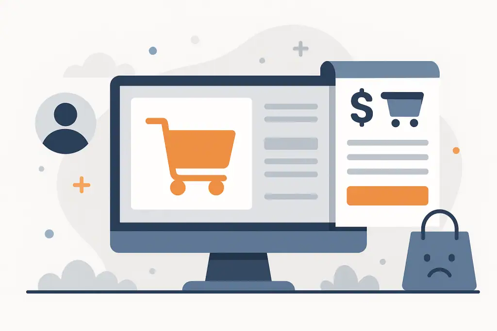
WooCommerce UX Psychology – Frequently Asked Questions
Customers often abandon the cart for small reasons, not big ones. Below are clear, practical answers to the most common questions about WooCommerce and UX-in a form you can easily include in your own article.
How can I tell where users get stuck in my WooCommerce store?
Use behaviour tools like GA4, Hotjar, or Clarity. They show scroll patterns, rage clicks, and drop-off points.
Is it worth reducing the number of fields in checkout?
Yes. Every field adds friction. Ask only what you really need to fulfil the order.
Do trust badges actually increase conversions?
They do, especially on mobile, where users feel more vulnerable to scams.
Should I force account creation in WooCommerce?
No. Guest checkout almost always converts better, especially for first-time customers.
Why do customers abandon the cart even with good prices?
Because the experience feels unclear, slow, or risky. UX often matters more than pricing.
Does page layout affect buying decisions?
A lot. Confusing layouts make users hesitate. Predictable layout improves flow and confidence.
Is sticky order summary useful in checkout?
Yes, it reduces anxiety by showing the final price and items all the time.
How often should I test UX changes?
Regularly. Even one small update per month can significantly reduce cart abandonment over time.